Configuration
Configuration for the CustomizableSelect React component.
Options
Property: options | Type: Array<OptionType> | Default: [] | Optional
An array of options to use.
Option properties
type OptionType = {
  label: string;
  value: string;
  html: React.ReactNode | React.ReactNode[] | React.FC | React.Component | string;
  selectedImageSrc?: string;
};
Option label vs html
- An option’s label shows within the select handle when the option is selected
- An option’s inner HTML is shown within the select dropdown
import CustomizableSelect, { OptionType } from "@padillaco/customizable-select";

const options: OptionType[] = [
  // An option with HTML content to show within the select dropdown.
  {
    label: "Option 1",
    value: "option-1",
    html: (
      <div className="example-class">
        <strong>Option 1</strong>
        <p>Lorem ipsum dolor sit amet, consectetur adipiscing elit, sed do.</p>
      </div>
    )
  },
  // An option with text content to show within the select dropdown.
  {
    label: "Option 2",
    value: "option-2",
    html: "Option 2"
  }
];

export default () => (
  <CustomizableSelect options={options}/>
);
Single or Multiple Selection
Property: multiple | Type: boolean | Default: false | Optional
The selection type — multiple when true, and single when false.
Sort Options
Property: sortOptions | Type: boolean | Default: false | Optional
Whether to sort options alphabetically (A-Z) by label.
No Options Text
Property: noOptionsText | Type: string | Default: No options found | Optional
The text to show when no options exist.
Select Handle
Icon
Property: icon | Type: React.ReactNode, React.FC , or React.Component | Optional
The icon to show within the select handle. Example:
const icon = (
  <svg xmlns="http://www.w3.org/2000/svg" viewBox="0 0 100 100" className="cs-icon">
    <circle r="45" cx="50" cy="50"/>
  </svg>
);
Selected Option Image
Property: showSelectedOptionImage | Type: boolean | Default: false | Optional
Whether to show the image that represents the selected option within the select handle. Selected option images are only displayed when the selection type is single. Example:
import CustomizableSelect, { OptionType } from "@padillaco/customizable-select";

const options: OptionType[] = [
  {
    label: "Option 1",
    value: "option-1",
    html: "Option 1",
    selectedImageSrc: "/images/example.jpg"
  }
];

export default () => (
  <CustomizableSelect options={options} showSelectedOptionImage={true}/>
);
Placeholder
Property: placeholder | Type: string | Default: Select an option | Optional
The placeholder text to show within the select handle. The placeholder is hidden if showSelection is false.
Selection Labels
Attribute: showSelection | Type: boolean | Default: true | Optional
Whether to show the selected option labels within the select handle.
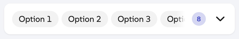
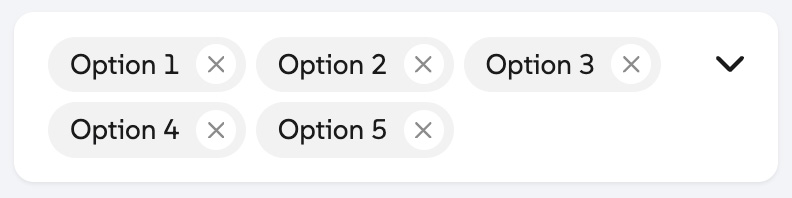
Multiple Selection Tag Style
Attribute: multipleSelectionTagStyle | Type: string | Default: tag-summary | Optional
The style of the selected option labels that show within the select handle when multiple selection is enabled. The following values are supported:
-
tag-summary: Displays each selected option label as non-removable tags all on one line without wrapping. A count of how many options are selected is also shown.
-
removable-tags: Displays each selected option label as removable tags that wrap to the next line.
Clear-all Button
Property: clearable | Type: boolean | Default: false | Optional
Whether to show a clear-all button that removes all selected options when pressed.
Dropdown Arrow
Property: showArrow | Type: boolean | Default: true | Optional
Whether to show an arrow icon within the select handle.
Existing Select Element
Select Element
Property: selectElement | Type: HTMLSelectElement | Default: null | Optional
The select element to use, instead of creating a new one. Using an existing select element helps maintain existing event listeners that may be registered by third-party scripts.
Search
Enable Search
Property: searchable | Type: boolean | Default: false | Optional
Whether to show a search input to filter options by search terms.
No Search Results Text
Property: noResultsText | Type: string | Default: No results found | Optional
The text to show when no options match the search terms.
Element Attributes
Wrapper Attributes
Property: wrapperAttrs | Type: object | Default: { } | Optional
HTML attributes that should be added to the wrapper’s DIV element. Example:
<CustomizableSelect options={options} wrapperAttrs={{
  id: "example-id",
  ariaHidden: "false"
}}/>
Select Attributes
Property: selectAttrs | Type: object | Default: { } | Optional
HTML attributes that should be added to the <select> element, excluding multiple, value, and tabindex.
Search Input Attributes
Property: searchInputAttrs | Type: object | Default: { placeholder: “Search” } | Optional
HTML attributes that should be added to the search input element, excluding value and tabindex.
Dropdown Preferred Width
Property: dropdownPreferredWidth | Type: number | Default: 100 | Optional
The preferred width of the dropdown element.
Dropdown Max Height
Property: dropdownMaxHeight | Type: number | Default: 350 | Optional
The max height of the dropdown element.
Using Custom SVG Icons
Property: useCustomIcons | Type: boolean | Default: false | Optional
If true, you’ll be able to use your own custom icons for the select component instead of the default icons. Edit the code below by replacing the contents of each <symbol> element, then add the HTML to the DOM.
<svg id="cs-icons" style="display:none">
  <defs>
    <symbol id="cs-checkmark">
      <path d="M438.6 105.4c12.5 12.5 12.5 32.8 0 45.3l-256 256c-12.5 12.5-32.8 12.5-45.3 0l-128-128c-12.5-12.5-12.5-32.8 0-45.3s32.8-12.5 45.3 0L160 338.7 393.4 105.4c12.5-12.5 32.8-12.5 45.3 0z"></path>
    </symbol>
    <symbol id="cs-xmark">
      <path d="M393.47,9.38c12.5-12.5,32.8-12.5,45.3,0s12.5,32.8,0,45.3l-169.4,169.3,169.3,169.4c12.5,12.5,12.5,32.8,0,45.3s-32.8,12.5-45.3,0l-169.3-169.4L54.67,438.58c-12.5,12.5-32.8,12.5-45.3,0s-12.5-32.8,0-45.3l169.4-169.3L9.48,54.57C-3.02,42.07-3.02,21.88,9.48,9.38c12.5-12.5,32.8-12.5,45.3,0l169.3,169.3L393.47,9.38Z"></path>
    </symbol>
    <symbol id="cs-magnifying-glass">
      <path d="M416 208c0 45.9-14.9 88.3-40 122.7L502.6 457.4c12.5 12.5 12.5 32.8 0 45.3s-32.8 12.5-45.3 0L330.7 376c-34.4 25.2-76.8 40-122.7 40C93.1 416 0 322.9 0 208S93.1 0 208 0S416 93.1 416 208zM208 352a144 144 0 1 0 0-288 144 144 0 1 0 0 288z"></path>
    </symbol>
    <symbol id="cs-chevron-down">
      <path d="M201.475,246.675c12.5,12.5,32.8,12.5,45.3,0L438.775,54.675c12.5-12.5,12.5-32.8,0-45.3s-32.8-12.5-45.3,0l-169.4,169.4L54.675,9.475C42.175-3.025,21.875-3.025,9.375,9.475s-12.5,32.8,0,45.3l192,192,.1-.1Z"></path>
    </symbol>
  </defs>
</svg>